Pedro Teles is a personal trainer and physical performance coach based in Gaia, Portugal.
Both in his physical studio or through his online programs, he offers individual guidance, personalized training programs, coaching, and nutrition counseling to all of his clients. His methods are a combination of his fitness expertise, scientific data analysis, high-performance workouts, and structured nutrition plans.

The Challenge
In order to take a step forward in the development of his personal brand, his fitness studio, and his online coaching platform, Pedro Teles decided to invest in the creation of a new brand identity that would distinguish him from all his competitors in the market.
Our challenge was split into two distinctive moments. Firstly, we were asked to come up with a new and improved brand name that would fit all branches of the business. Once that was established, we were then asked to create the visual identity around the name and roll out that same identity to all other branches.
Our Approach
1- Create the brand’s new name “Progress Lab by Pedro Teles", as it suggests a focus on the improvement and physical growth of all those who are part of the brand’s universe;
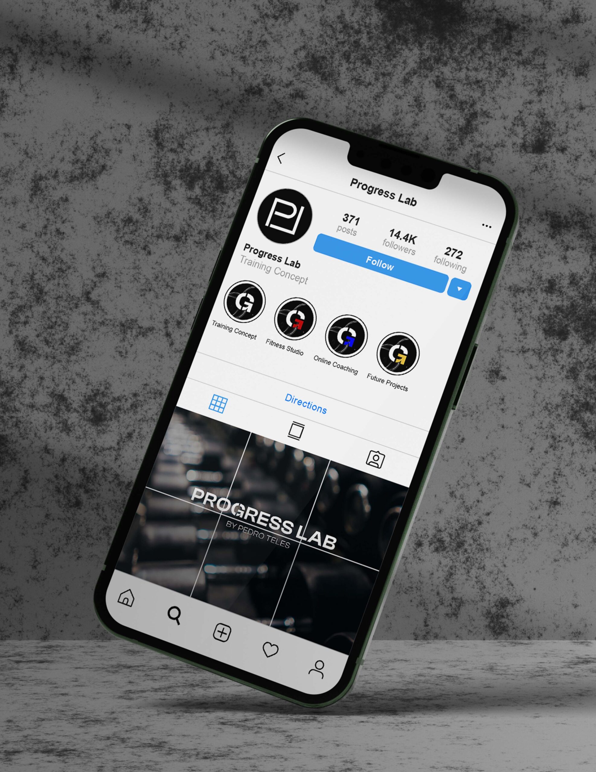
1.1- Develop a monolithic branding system, centered around a mother brand from which several sub-brands emerged;
1.1.1- Progress Lab by Pedro Teles: The Training concept became the mother brand.
1.1.2- Progress Lab: Fitness Studio became the name of all things studio-related;
1.1.3- Progress Lab: Online Coaching became the name of all things online;
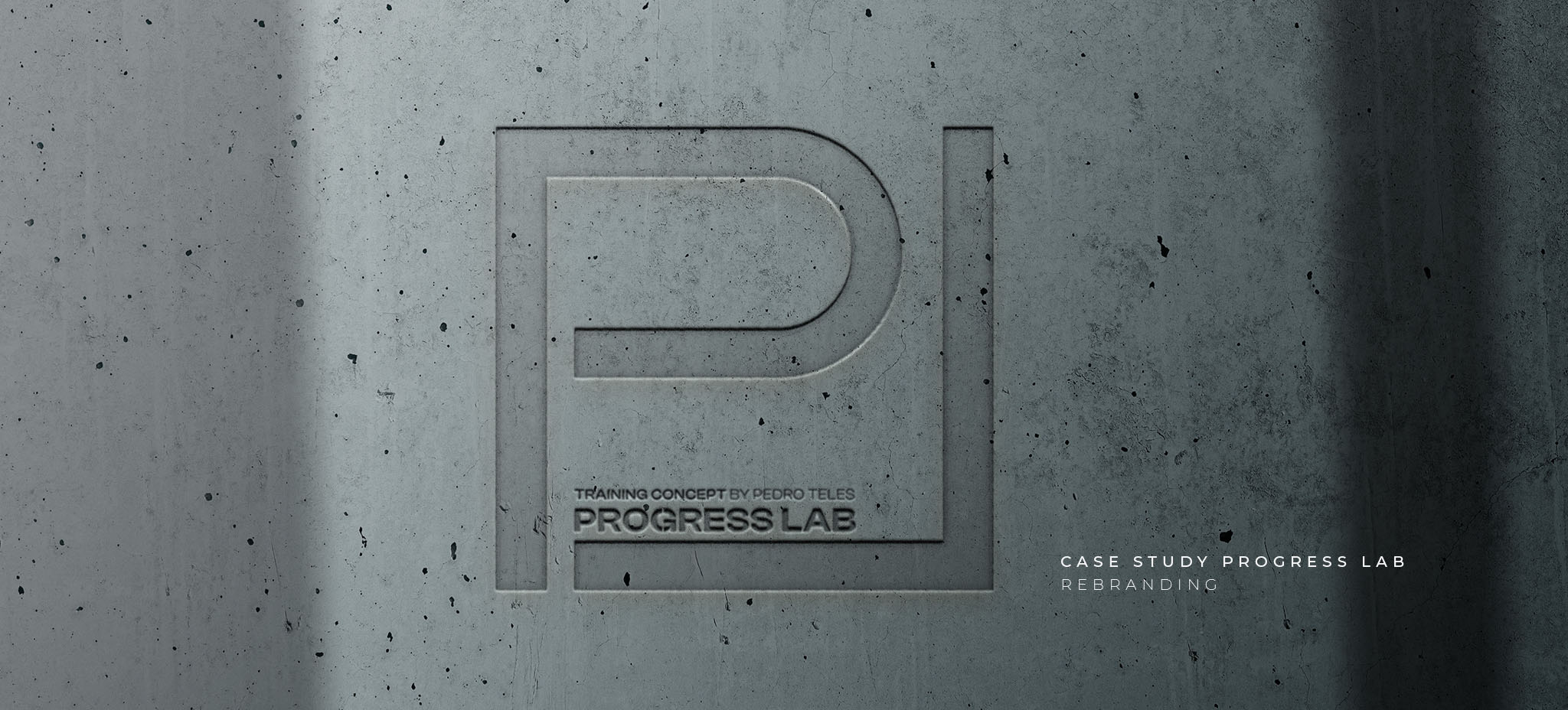
2- Create the brand’s main logo from the sharpness of the initials PL, leaving an intentional connection between the two letters, inserted in an implied quadrilateral shape and representing the universe of the continuity of the term “Progress";
2.1- Define Clash Display as the official typography due to its structured design and strong lines;
2.2- Implemente the branch denomination inside the graphic logo;
2.3- Stylize the letter G by turning it into a circular arrow, symbol of progress;
3- Roll-out of secondary logos following the already-established brand guidelines and strategy;
4- Define a color palette representing each of the branches;
5- Develop a logo animation to be used as the launch of the new brand across social media platforms.
Results of Our Work
This project originated an elegant, strong, and modern logo, making the Progress Lab by Pedro Teles project much more than a gym. Not only did we create a modern, strong, and clean identity, but we also left the door open for the already desired growth and expansion of the brand. Much more than a logo, the entire rebranding led to the creation of a strong and unified brand, allowing each branch (present or future) to equally exist on its own while still fitting into the Progress Lab by Pedro Teles universe.
